Whorlmap: An Uncertainty-aware Heatmap
Whorlmap: An Uncertainty-aware Heatmap
Heatmaps are for making a lot of things visible at once using color as a third dimension. In modern biology, there are a lot of matrices of heatmaps: you tile a matrix of effect sizes, assign a color scale, and suddenly the structure of a high-dimensional experiment is visible at a glance. It allows quick detection of dataset-wide patterns. The problem is that the one-color-assignment-per-cell for a point estimate (usually the mean) is quite flat and loses a lot of the beautiful complexity of the raw data.
In recent years, we in the scientific community have actually been trying to move in the opposite direction, showing more and more raw data: bar plots are replaced with swarm plots,1,2 boxplots replaced with raincloud plots,3 superplots,4 single-cell violins.5 This not only indicates a move towards transparency, but also reflects our inherent curiosity for the complexity existing in our data. Heatmaps, however, lag by quite a bit because so much is already packed into one plot.
This became a concrete annoyance while we were building the phenovector visualizations for the ethomics project. We had a matrix: one row per neural manipulation, one column per behavioral feature, each cell a standardized effect size. The heatmap showed the clustered structure we cared about. But it quietly merged two very different kinds of pale square: one that was pale because the effect was small and well-estimated, and one that was pale because the effect was noisy and we’d seen almost anything. A confident null and an ambiguous mess look the same when you reduce both to their means.
We couldn’t solve this by adding error bars, because error bars don’t tile. A single cell with a mini-violin or a confidence interval is readable. Thirty rows by seventeen columns of mini-violins is a disaster and the overview disappears, which is the only reason to make a heatmap in the first place. We tried rows of forest plots, color saturation as a proxy for precision. They all either broke the matrix structure, required the reader to mentally fuse things, or confounded the colormap that was already a stretch for the brain.
So the design question became: can the uncertainty live inside the cell, without destroying the ability to scan across it? (There is actually prior thinking6 on this, except we didn’t see this until we had implemented ours.)
Anyway, here is the design: Whorlmap samples the bootstrap distribution behind each effect and arranges those samples spatially inside the cell, with color still encoding signed effect size. A tight, coherent distribution produces a visually coherent cell.
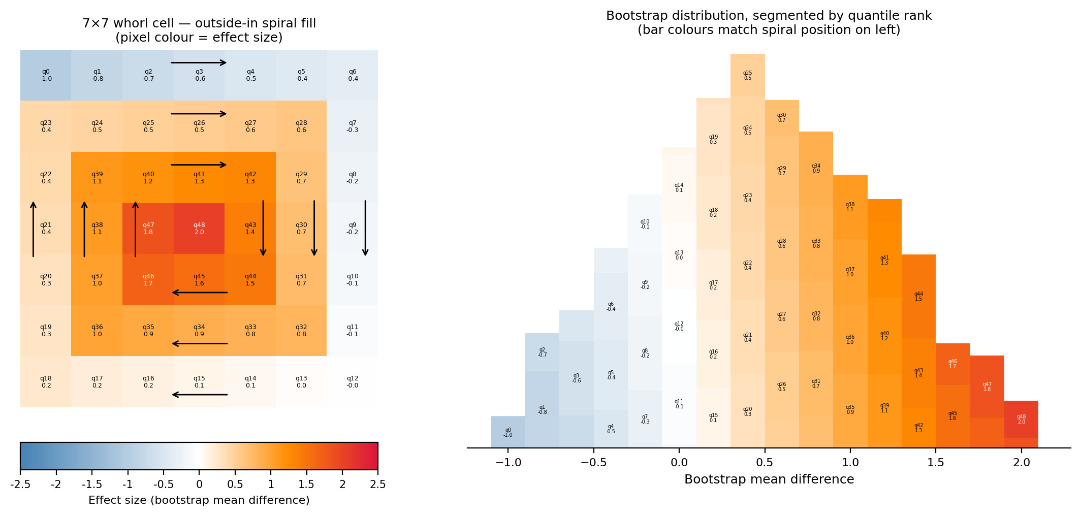
A noisy, wide distribution produces a mixed cell where color varies across the tile. The matrix still tiles and the overview is intact. But a reader who wants to know whether a particular cell is actually well-estimated can see it directly.
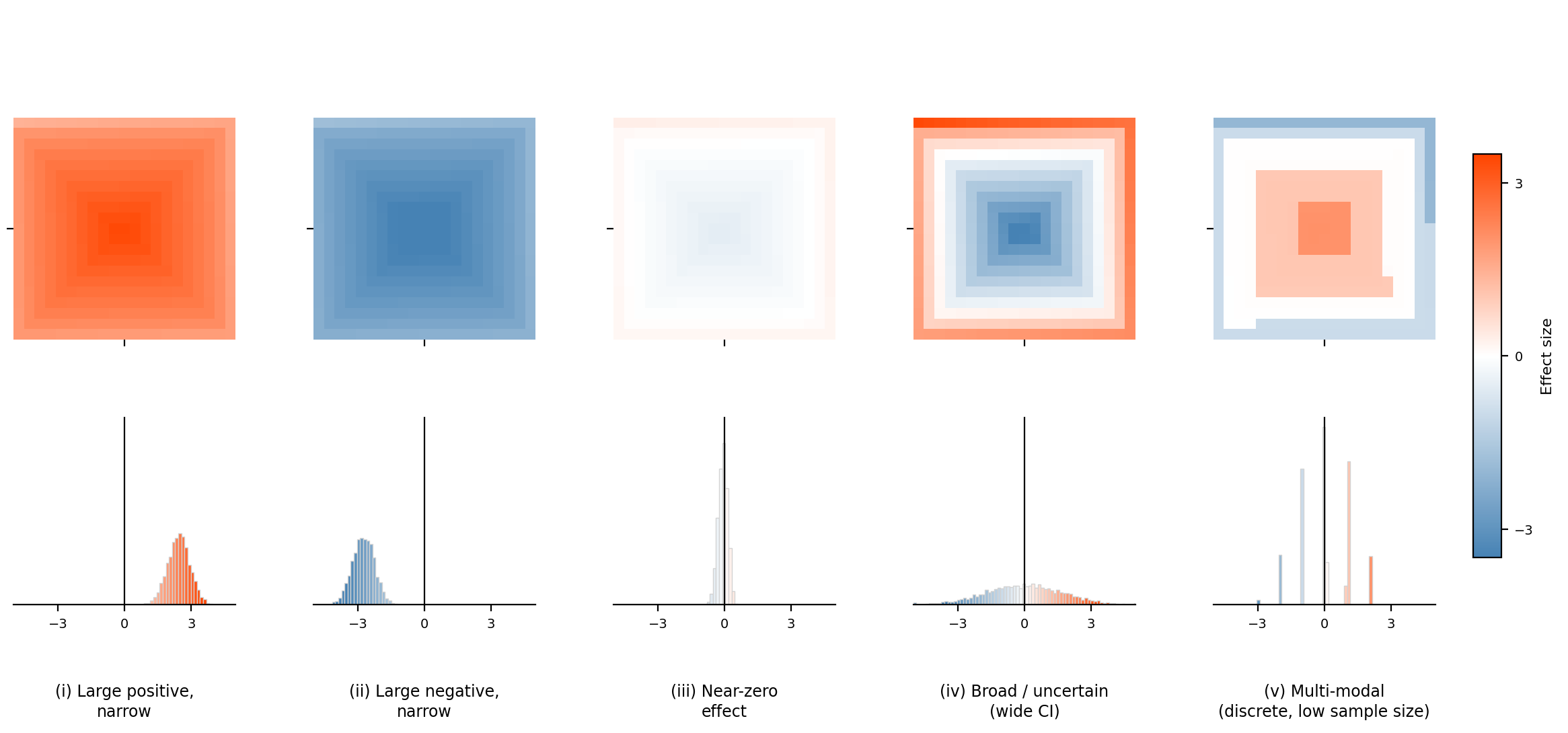
The name came from the visual form: the samples spiral outward from the cell center in a small rectangular whorl, repeating across the grid. It’s still scannable as a heatmap. It’s just a heatmap that hasn’t discarded what it knows about each estimate.
There’s a continuity here with DESTRA that I find very satisfying. DESTRA asks you not to trust a single behavioral metric in isolation — to look at the full profile, and see whether the pattern is coherent. Whorlmap asks the same thing about a heatmap cell: not to trust a single color in isolation, but to look at the distribution and see whether the estimate is well-founded. The instinct is the same in both cases. Keep more of the evidence visible for people who want to look for it. Don’t let a tidy summary erase the variation that makes the conclusion honest.
Whorlmap is an early proof of concept for this kind of uncertainty-aware heatmap cell, with example analyses and a reproducible workflow. I’d be curious to know where people find it useful and where it fails, particularly in denser matrices or with different kinds of distributions than the ones we built it around.
Read more about how we implemented the whorlmap design ↗
References
- Wilkinson, L. (1999). Dot plots. The American Statistician, 53(3), 276–281. doi:10.1080/00031305.1999.10474474
- Weissgerber, T. L., Milic, N. M., Winham, S. J., & Garovic, V. D. (2015). Beyond bar and line graphs: time for a new data presentation paradigm. PLOS Biology, 13(4), e1002128. doi:10.1371/journal.pbio.1002128
- Allen, M., Poggiali, D., Whitaker, K., Marshall, T. R., & Kievit, R. A. (2019). Raincloud plots: a multi-platform tool for robust data visualization. Wellcome Open Research, 4, 63. link
- Lord, S. J., Velle, K. B., Mullins, R. D., & Fritz-Laylin, L. K. (2020). SuperPlots: communicating reproducibility and variability in cell biology. Journal of Cell Biology, 219(6), e202001064. link
- Hao, Y., Hao, S., Andersen-Nissen, E., et al. (2021). Integrated analysis of multimodal single-cell data. Cell, 184(13), 3573–3587. doi:10.1016/j.cell.2021.04.048
- Keim, D. A. (2000). Designing pixel-oriented visualization techniques: theory and applications. IEEE Transactions on Visualization and Computer Graphics, 6(1), 59–78. pdf
This work was done in collaboration with Adam Claridge-Chang.